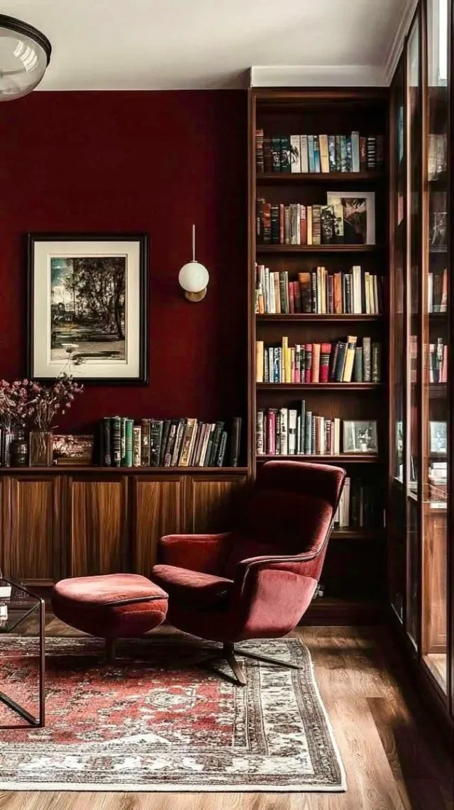
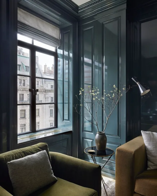
The direction a room faces dictates the quality, warmth, and intensity of sunlight it receives throughout the day, which directly transforms how paint pigments look on your walls. A warm cream can turn stark grey in a north-facing room, while a crisp blue can look dull and muddy in golden late-afternoon west light. To choose a paint colour that works, you must pair the room’s natural light temperature with complementary paint undertones and an appropriate Light Reflectance Value (LRV).
If you have seen a paint shade you love in a magazine or online photo, remember that it was photographed under specific lighting. Uploading that photo to a free colour matcher will give you exact paint codes across Sherwin-Williams, Benjamin Moore, and Farrow & Ball, but evaluating how that specific code interacts with your window direction remains the critical final step.
Natural Light Physics: Temperature, Undertones, and LRV
Natural light varies in color temperature measured in Kelvin, ranging from cool blue tones (around 6,500K) under indirect skylight to warm golden hues (around 2,500K) during sunset. Light Reflectance Value (LRV) measures the percentage of light a paint colour reflects on a scale from 0 (absolute black) to 100 (pure white). High-LRV paints reflect available natural light back into the room, while low-LRV paints absorb light, creating depth.
Paint formulations rely on undertones—secondary colours blended beneath the dominant shade. Cool natural light amplifies cool undertones (blue, green, violet), making them feel icy or clinical. Warm natural light amplifies warm undertones (yellow, peach, red), making whites look creamy and cool tones appear balanced. Ignoring undertones when selecting paints is the single most common reason a finished wall looks radically different from a paper colour swatch.
North-Facing Rooms: Countering Cool, Indirect Light
North-facing rooms receive indirect sunlight all day, producing a cool, bluish light quality that makes paint colours look darker and flatter than expected. Cool greys, icy blues, and stark whites will feel sterile and cold in a north-facing space.
To make a north-facing room feel inviting, select paint colours with explicit warm undertones, such as yellow, pink, or warm terracotta. Avoid cool undertones like blue or green slate unless you intentionally want a moody, dramatic aesthetic. Medium-to-high LRV paints (LRV 60–80) help bounce diffuse northern light, though low-LRV dark shades can also work well if you lean into a cosy, enveloped atmosphere.
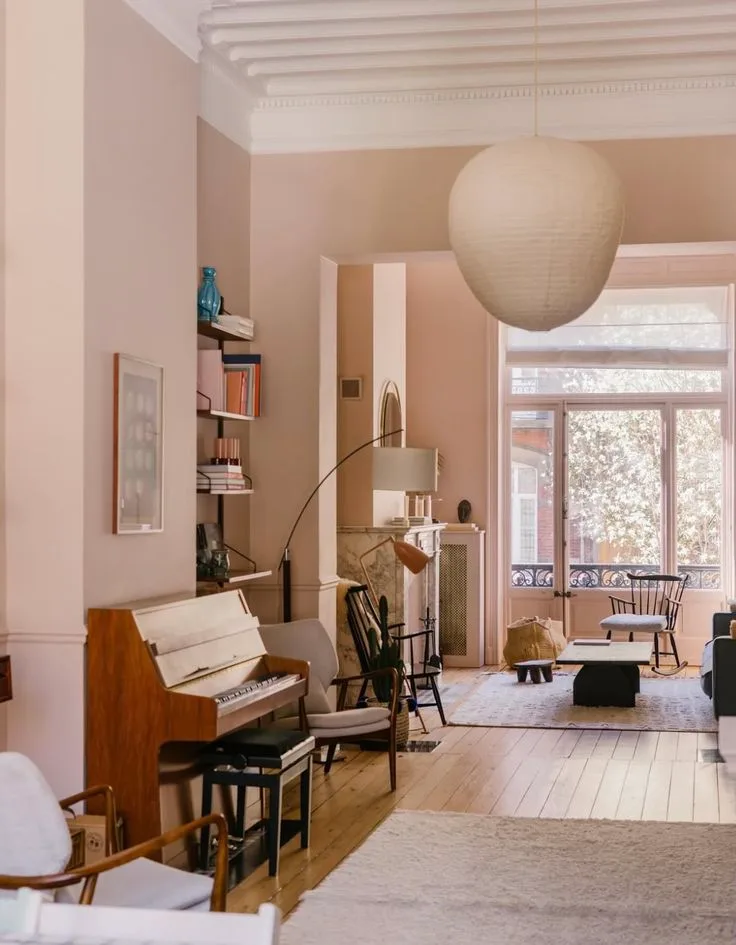
Top Paint Picks for North-Facing Rooms
- Farrow & Ball Setting Plaster (No. 231): A soft, dusty pink with yellow undertones that transforms cool northern light into a gentle glow.
- Sherwin-Williams Alabaster (SW 7008 | LRV 82): A warm off-white containing subtle yellow-cream undertones that neutralises blue shadows without looking overly yellow.
- Benjamin Moore Warm Blush (2003-70 | LRV 73): A delicate peach shade that adds warmth to shadow-heavy corners.
- Farrow & Ball Joa's White (No. 226): A warm, taupe-backed neutral that maintains depth under flat light.
South-Facing Rooms: Harnessing Warm, All-Day Sunlight
South-facing rooms enjoy intense, golden sunlight from morning through late afternoon, rendering almost all paint colours bright, warm, and clear. Because southern exposure naturally warms the space, strong yellow or pink undertones can sometimes look overly vivid or saturated.
South-facing spaces offer maximum flexibility. Cool undertones—such as blue-greys, sage greens, and crisp greys—balance the natural warmth of the sun and keep the space feeling fresh. If you prefer warm neutrals, choose understated shades with neutral or beige undertones rather than heavy yellow bases. Paints with an LRV between 40 and 70 prevent blinding glare during peak sunshine hours.
Top Paint Picks for South-Facing Rooms
- Benjamin Moore Hale Navy (HC-154 | LRV 8): A rich navy that absorbs intense southern sunlight while displaying crisp, clean blue undertones.
- Farrow & Ball Pigeon (No. 25): A muted grey-green that shifts beautifully throughout the day without feeling washed out.
- Sherwin-Williams Agreeable Gray (SW 7029 | LRV 60): A popular greige that balances subtle warm grey notes against bright southern rays.
- Benjamin Moore Paper White (1590 | LRV 74.4): A fresh white with grey-blue undertones that counters golden highlights.
East-Facing Rooms: Managing the Morning Shift
East-facing rooms experience bright, clear morning light with soft yellow-white hues, followed by cooler, shadow-filled light in the afternoon as the sun passes overhead. This dual-character lighting requires a balanced paint shade that looks inviting in both high sun and low shadow.
To compensate for afternoon shadows without making morning sunlight feel scorching, choose colours with soft warm undertones—like pale peach, creamy greige, or soft cream. If your east-facing room is primarily used in the evening (such as a dining room or bedroom), select colours based on how they perform under artificial lighting in cool afternoon conditions.
Top Paint Picks for East-Facing Rooms
- Benjamin Moore Revere Pewter (HC-172 | LRV 55): A medium-toned greige that holds its balance during morning brightness and afternoon shade.
- Farrow & Ball Dimity (No. 2008): A very pale taupe-pink off-white that feels warm in cool afternoon light without flaring up in morning sun.
- Sherwin-Williams Sea Salt (SW 6204 | LRV 63): A grey-green with muted blue undertones that sparkles in morning sun and stays calm later in the day.
West-Facing Rooms: Balancing Sunset Intensity
West-facing rooms start the day in cool shade, then experience intense, warm, golden light during the late afternoon and early evening. The dramatic shift in light intensity can cause pale oranges and yellows to look fiery around sunset.
To balance west-facing light, choose muted, warm-neutral shades or soft greens and dusty blues that soften late-afternoon heat. Avoid hyper-saturated warm shades unless you want a vibrant, sunset-hued room. A medium LRV (50–65) works best to tame late-day glare while maintaining brightness during shaded mornings.
Top Paint Picks for West-Facing Rooms
- Benjamin Moore Swiss Coffee (OC-45 | LRV 83.9): A classic warm off-white that absorbs afternoon glow without turning orange.
- Farrow & Ball French Gray (No. 18): A relaxed green-grey that cools down intense sunset light while providing warmth in dull morning light.
- Sherwin-Williams Repose Gray (SW 7015 | LRV 58): A cool-leaning neutral greige with faint blue-purple undertones that offsets golden hour warmth.
Quick Guide: Light Direction vs Paint Selection
| Room Exposure | Light Quality | Ideal Undertones | Recommended LRV Range | Paints to Avoid |
|---|---|---|---|---|
| North | Cool, bluish, shadow-heavy | Warm yellow, pink, red, terracotta | 60–82 (or lean dark < 15) | Icy blues, stark cool whites, blue-greys |
| South | Warm, golden, intense all day | Cool blue, grey, sage green, neutral greige | 40–70 | Hyper-saturated yellows, bright creams |
| East | Bright morning, cool afternoon | Soft warm peach, pale cream, balanced greige | 55–75 | Heavy blue-greys, cold stark whites |
| West | Shadowy morning, intense sunset glow | Muted greens, grey-blue, soft warm neutrals | 50–65 | Bright oranges, warm buttery yellows |
How to Test Paint Swatches in Real Light
Never buy paint based on a small paper chip viewed under store fluorescent lights. Paint colours react dynamically to window layout, surrounding foliage, and interior artificial light.
- Use Large Swatches: Apply two coats of sample paint onto 50cm x 50cm poster boards or use peel-and-stick samples rather than painting directly onto existing wall colours.
- Test Multiple Walls: Move your swatches between walls directly adjacent to windows and walls in deep shadow.
- Observe Across 24 Hours: Check the swatch at 8:00 AM, 12:00 PM, 5:00 PM, and under your room's evening lamps. Notice how undertones emerge as light temperature changes.
- Evaluate Finish Impact: Flat/Matt finishes absorb light and soften color shifts; Eggshell and Silk/Satin reflect light, making undertones more pronounced.
If you are planning a whole-home palette across mixed light exposures, exploring our color tools on how it works will guide you from image matching to professional paint application. For complex spaces with multiple window orientations, consulting qualified colour designers or checking our directory of vetted colour designers helps ensure your palette flows smoothly room to room. Professional painters listed in our pro network can also assist with sample patch preparation and finish selection to guarantee an flawless final coat.